LPS gets a new look!
To celebrate the start of our 11th year, Letters to a Pre-Scientist got a makeover.
You may have noticed that a few months ago we got a redesigned website complete with a refreshed logo. These updates launched with the start of the 11th year of the LPS pen pal program.
Our original logo was created by co-founder Anna Goldstein’s husband, Kyle Broaders, in his spare time. As Anna wrote about in her blog celebrating our first decade, our program model today looks quite similar to the original one launched in rural North Carolina in 2010. So, as we grew, some aspects of our original logo remained relevant, such as the envelope which represents the snail mail pen pal interaction.
However, after revisiting and updating our mission statement a year ago, we recognized that some key parts of our model and mission were missing from the logo. We teamed up with Jennifer Power Design, who led our brand redesign process with thoughtfulness, patience, and talent!
First, we surveyed students, STEM professionals, teachers, and donors to inform the development of the new brand. We also asked them to describe LPS in three words. Here is a visual representation of how our community describes us:
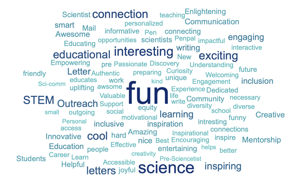
We also asked them what they liked and what they felt was missing from the original logo. Over 70% of people said they liked the envelope, and hoped it would remain in the new logo. They identified three missing pieces: acknowledgement that the program focuses on connecting people together, the T, E, and M from STEM (Science, Technology, Engineering, and Math), and our focus on increasing access to STEM education and representation in STEM careers.
With this feedback in mind, we set out to create a fun, colorful logo that was new but familiar. After all, we’ve spent the past decade building awareness about our program and mission with the original logo – it was important that we didn’t end up with something unrecognizable.
Here’s the before and after:
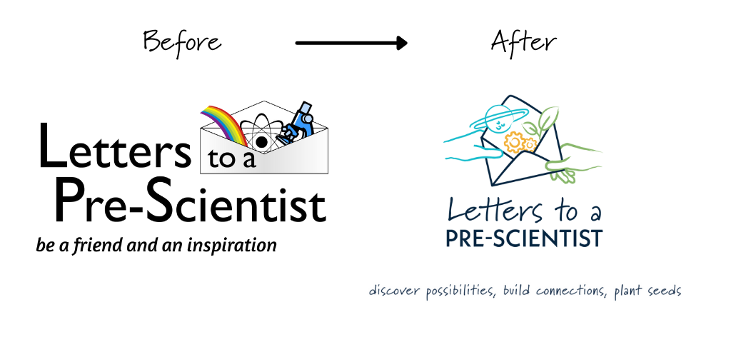
To include the human connection piece of our program, we added two hands passing the envelope to each other. These hands are intentionally different colors to represent our focus on creating a diverse and inclusive future of STEM. We broadened the icons emerging from the envelope to represent all of STEM (which was a challenge with only three images!) We selected a handwritten-looking font to further illustrate the personalized touch of snail mail letters.
Finally, we recognized the opportunity to broaden our focus from a logo that was STEM professional centered to one that represents the roles and goals of each of our key stakeholders in the program. Students, teachers, and STEM professionals each contribute to our overall ability to deliver on our mission to inspire all students to explore a future in STEM. We gave each stakeholder a color, icon, and part of the slogan. Students discover possibilities (blue planet icon), teachers build connections (orange gear icon), and STEM professionals plant seeds (green sprout icon). Together, we make sure more students get the opportunity to discover their talent and potential in STEM.
Our new logo is a great balance between new and original. It supports our work as we continue to grow and mature as an organization, and we believe it will help new people quickly understand what we are about.
What thoughts does the new logo inspire for you?